Negative-Space Review for Badge-Style Line Art
The negative space in line art is ready for the next review when its gaps, counters, bridges, and surrounding areas remain clear at the intended display size. That is an artwork judgment, not production approval.

Start with three visible checks: enclosed counters should remain open, adjacent strokes should not create accidental joins, and every bridge should appear intentional. Then inspect the path view and record the smallest meaningful gap, narrowest stroke, and unresolved scale-dependent detail for a shop-specific test request.
What to Inspect First
A badge usually relies on a compact silhouette, repeated contours, and small internal openings. Negative space is not leftover background. It separates grouped forms, keeps counters readable, and helps the eye distinguish one contour from another.
The preview shows whether those relationships work in the artwork itself. It does not show whether a selected process and material will preserve them during engraving, cutting, or another production method.
Enclosed Counters
Inspect every enclosed counter inside a letter, emblem, animal form, tool, or decorative mark. An opening that looks clear at a large working view may become crowded when the badge is reduced to its intended display size.
- If the counter reads as an intentional opening, mark it as a decided artwork feature.
- If nearby strokes nearly meet, mark the area as provisional.
- If the opening disappears at the intended size, simplify the surrounding contour before vector cleanup.
Do not assign a universal minimum opening from this review. The useful question is whether the counter remains recognizable in this specific concept and size.
Narrow and Ambiguous Gaps
Look between parallel contours, lettering, interior details, and the badge boundary. Narrow gaps can make separate forms appear joined. An ambiguous gap may suggest a cutout, shadow, seam, or accidental break when the concept has not clearly chosen one reading.
Available closure research supports a limited perception point: viewers can complete some intentionally incomplete forms, while excessive omissions can affect recognition. In badge art, a gap may add character at one scale and weaken recognition at another.
For each narrow gap, decide what the viewer should see first. If that reading is uncertain, document the design decision instead of treating the gap as a production assumption.
Intentional Bridges
A bridge connects separated areas or preserves a chosen structure. In a preview, it may appear as a short stroke joining an outer contour, letterform, or internal detail.
- Confirm that the bridge is visible at the intended display size.
- Check that the connection is deliberate rather than caused by overlapping strokes.
- Record its role for the person preparing the paths or production file.
A bridge can support grouping, but it can also close a counter or merge two shapes. The path view indicates whether the contour is continuous and whether the bridge has been represented as an intentional path feature.
Line Width and Negative Space
Line width and negative space work as a pair. A heavier stroke reduces the surrounding opening. A lighter stroke may preserve a gap but weaken the badge's visual weight or make a contour less distinct.
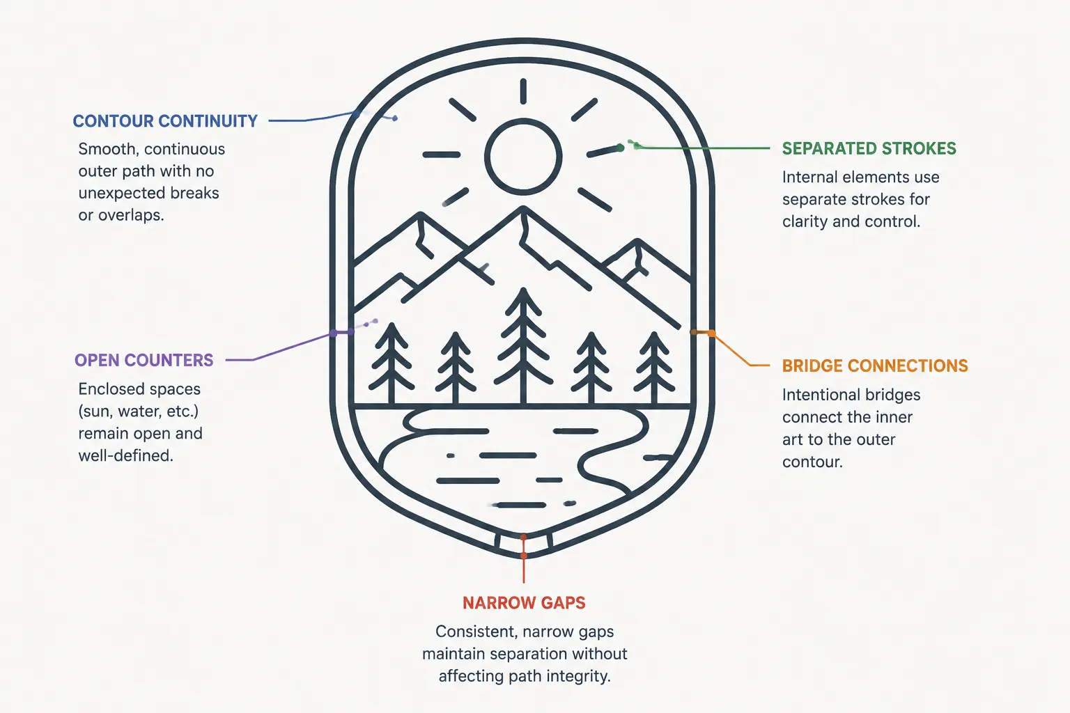
Compare each stroke with the nearby space rather than judging line weight in isolation. A line can look balanced on the outer border and crowded around a small counter. An internal detail may seem too light in the full artwork but read correctly after the badge is reduced.
Available perception material helps explain the roles of edges, contour selection, and line-drawing clarity. It does not establish a universal stroke width for badge artwork. Any production effect remains dependent on the process, material, machine, scale, and shop workflow.
Record the narrowest stroke as a question for the shop, not as a confirmed limit. The shop should decide how that feature is evaluated in the selected context.
Surrounding Space and Grouping
Inspect the space around the badge as carefully as the openings inside it. Uneven surrounding space can make the mark appear off-center even when the outer contour is geometrically centered.
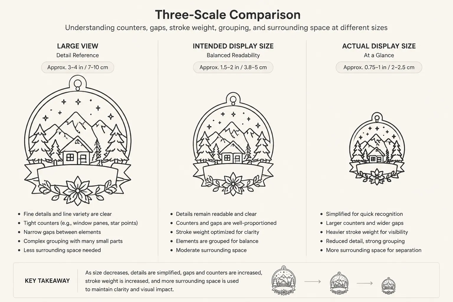
Check the distance between the badge edge and its internal forms. Then compare the visual weight of open areas on opposite sides. A dense cluster beside a broad empty area may be intentional, but it should read as a decision rather than an unresolved imbalance.
Line-drawing research offers a useful boundary: selected contours can carry more information than every possible surface detail. For a compact badge, removing a low-value contour may preserve the main form more effectively than retaining every small mark.
This is a review of visual priority. It is not evidence that a simplified badge will reproduce successfully.
Artwork Review Versus Production Validation
A concept preview can show whether the negative-space structure is understandable on screen. A path view can show whether contours, counters, and bridges have been translated into deliberate vector relationships. Neither confirms the final result on a particular material or machine.
- Decided: the visible gap, counter, bridge, contour, or surrounding-space choice in the approved concept.
- Provisional: the likely effect of reducing scale, changing line weight, or simplifying a detail.
- Shop-dependent: reproduction behavior for the selected process, equipment, material, and exact size.
The available research concerns closure, contours, edges, and line-drawing perception. It helps explain why sparse line work can remain coherent and why missing or poorly selected features can change recognition. It does not provide a badge-specific production threshold, firsthand test record, or machine setting.
Process-specific findings may also explain why open areas can be vulnerable to spreading, filling, or edge noise in some reproduction methods. Measurements from one printing process and its substrates cannot be transferred to laser engraving, cutting, or every other workflow.
Compact Handoff Review
Before routing the artwork, document these observations:
- Which enclosed counters must remain open?
- Which narrow gaps could be mistaken for joins or filled areas?
- Which bridges are intentional?
- What is the narrowest visible stroke?
- Does the badge still group correctly at the intended display size?
- Does the surrounding space look balanced around the outer contour?
- Which details can be simplified if recognition weakens?
- What exact material, process, scale, and equipment context should the shop review?
These questions are not a universal pass-or-fail rule. They identify what needs confirmation and who owns the next decision.
The Next Check
Export or inspect a clean path view at the intended size. Mark each unresolved gap, counter, bridge, and narrow stroke, then send the shop a test request naming the exact material, process, scale, and equipment context.
Ask the shop to confirm whether enclosed counters remain open and whether the selected details retain their intended grouping. Until that exact-size review or documented test exists, treat the badge as a visually reviewed concept rather than an approved production file.