Composition and Negative-Space Planning
A line-art concept can look balanced on screen while leaving important handoff questions unresolved. Review the visible relationships between the outer contour, internal details, open spaces, and surrounding margins before vector cleanup or shop-specific preparation.
The useful decision is not whether the artwork looks attractive in isolation. It is whether the composition makes its structure easy to inspect, discuss, approve, and route for further confirmation.
This branch-level review focuses on balance, emphasis, contours, counters, bridges, gaps, and the ownership boundaries between visual decisions and production questions.
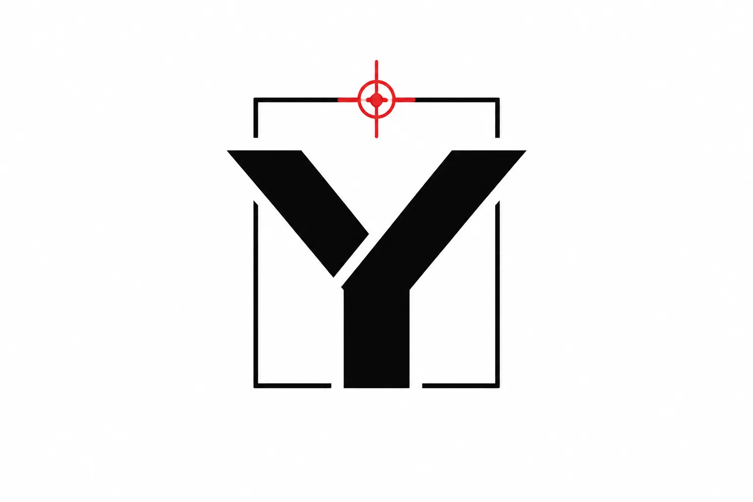
The composition is visually defined, but its narrow gaps and interior bridges remain shop-dependent.
A concept preview shows an idea. A path view shows prepared geometry. A test-piece record shows what happened in a stated equipment, material, scale, and workflow context. These records should remain separate.
More specific pages
These pages continue the topic in smaller, more specific directions.
What Line Art Composition Needs to Resolve
Composition is the arrangement of visual elements into a coherent unit. In line art, those elements may include the outer silhouette, interior strokes, counters, bridges, open gaps, repeated forms, and the margin around the mark.
Negative space is the visible space between and around drawn elements. Its shape, direction, and distribution affect grouping and emphasis. It is not merely unused background.
For a badge-style mark, identify four layers of information:
- Structural form: the outer silhouette and major internal divisions.
- Recognition cues: contours and intersections that make the subject understandable.
- Open-space behavior: counters, gaps, channels, and surrounding breathing room.
- Handoff dependencies: features that may require a path review or test piece in a stated context.
This framing keeps a visual judgment precise. It also prevents a mockup from being treated as a production-approved file.
Balance, Emphasis, and Reading Order
Balance describes how visual weight is distributed within the format. It does not require both sides to mirror each other.
A symmetrical badge can organize weight around a central axis. An asymmetrical badge can still feel stable when a smaller dense area counterbalances a larger open area. The intended product, viewing scale, subject, and approval preference determine which arrangement is useful.
Inspect the mark as a single shape
Look at the design as a single-color shape before reading its details. Reduce the preview, step back from it, or soften the internal marks temporarily. Notice where the darkest or most concentrated areas sit.
A dense cluster near the lower edge may make the badge feel bottom-heavy. A broad open area on one side may give a small counterform more emphasis than intended. The likely consequence is a change in reading order, not an automatic production failure.
Compare the following relationships:
- The subject center and the badge center
- Dense areas against open areas
- The visual weight of the top and bottom zones
- The focal feature and its surrounding margin
- Repeated elements that create either rhythm or an uneven cluster
Geometric centering is only one reference. A mathematically centered mark can appear displaced when one side carries more dark structure.
Compare symmetrical and asymmetrical directions
A symmetrical composition offers predictable alignment and can suit monograms, seals, crests, and formal badges. Its tradeoff is that small inconsistencies become more visible, and equal intervals can make the design feel rigid.
An asymmetrical composition can create direction and emphasis. Its tradeoff is that uneven open spaces require closer inspection because they may look accidental rather than intentional.
Record the choice with a reason. “Simplified version approved for clearer hierarchy” gives the next reviewer more useful information than “version B looks cleaner.”
Check the first, second, and third read
Describe the composition in three passes:
- First read: the feature noticed immediately.
- Second read: the form that clarifies or supports it.
- Third read: detail that rewards closer inspection.
If every feature competes at the first read, the hierarchy may need revision. If the second read does not clarify the first, the main contour or internal structure may be carrying too little authority.
A useful review note names the sequence directly: the center emblem reads first, the upper branches clarify the subject, and the small interior marks currently compete with both.
Contours Carry Structural Information
A contour is a boundary that helps define a form. In simplified line drawings, not every visible edge deserves equal attention. Some contours communicate structure more reliably than surface detail.
Research on line-drawing recognition offers a useful visual boundary: selected structural contours can support recognition more effectively than less stable surface indications. That evidence concerns representation and perception. It does not establish a universal line, gap, or machine threshold.
Separate structure from decoration
Structural contours may describe the outside silhouette, an occlusion boundary, a major change in direction, the edge of a recognizable feature, or a junction that explains how forms meet.
Decorative strokes may add texture, motion, pattern, or character without defining the subject. Review two versions:
- A structural version containing only the contours needed to identify the form
- A detailed version with texture, accents, and secondary marks restored
If the structural version remains clear, the detail has a supporting role. If the subject becomes ambiguous without decoration, the contour relationships need attention before cleanup.
Follow contour continuity
Trace each important contour through its junctions. Note where it stops without a clear reason, collides with another line, changes direction sharply, enters a narrow gap, weakens beside a heavier line, or forms an unclear connection.
A contour can appear complete even when it is not physically continuous. A continuous path can also remain difficult to read when surrounding space is crowded. The immediate check is whether the viewer can infer the intended boundary without guessing at every junction.
Counters, Bridges, and Gaps
Counters are enclosed or partially enclosed areas within a form. Bridges are connecting sections that keep separate areas related. Gaps are open spaces between lines or between a line and the surrounding contour.
These terms describe visible relationships. They do not prescribe universal dimensions. Their behavior depends on the intended scale, exact material, equipment, workflow, and test context.
Review counters as shapes
Inspect the counter itself rather than only the lines surrounding it. Consider whether its shape is deliberate, whether it repeats a nearby curve or direction, and whether it still reads when the design is reduced.
A small counter surrounded by dark strokes may disappear into the mark's density. A large counter may weaken the form by removing too much structural connection. The concept review can identify the counter as a concern, but a context-specific path review or test piece addresses the production question.
Review bridges for meaning
A bridge may preserve the identity of a letter or symbol. It may also create an unwanted connection between adjacent forms.
Inspect its role in recognition, its relationship to the outer contour, the open space around it, and whether it creates a new enclosed area. Mark a bridge as structural when it is visually necessary. Mark it for revision when it exists only because rough paths overlap.
Treat gaps as intentional forms
The space between two strokes has a shape. Isolate open areas and inspect them as if they were drawn forms. This can reveal uneven spacing, unplanned wedges, trapped pockets, near-touching contours, or openings that do not match the rest of the badge.
Some gaps look intentional because they repeat a pattern or align with the main direction. Others taper unexpectedly, close at one end, or vary without a visible reason. State what the preview shows, then route any reproduction question to the shop.
Open-Space Distribution and Surrounding Margins
Open-space distribution describes where breathing room appears inside the mark. Surrounding margins describe the space between the artwork and its enclosing badge, plaque, sign area, or product boundary.
Review three zones:
- Interior space: openings inside letters, symbols, and illustrated forms
- Interval space: gaps between neighboring elements
- Boundary space: margin between the artwork and its enclosing edge
These zones do not need to match. They do need to relate. A narrow internal gap beside a broad outer margin can make the interior feel congested. A wide opening beside a tight boundary margin can push the composition toward the edge.
Check the edge relationship
Inspect the closest points between the artwork and the badge edge. Look for a contour that leans into the boundary, a cramped corner, an unequal margin without a visible reason, a repeated element that breaks rhythm, or a detail competing with the edge.
A composition that balances on an open canvas may need revision inside a circular, rectangular, arched, shield-shaped, or irregular product boundary. The intended boundary should appear in the preview before margins are approved.
Use reduction as a visual check
At the intended presentation scale, note which counters merge, which secondary strokes become apparent outlines, which bridges disappear, and whether the outer silhouette remains strong.
Reduction prioritizes questions for cleanup and testing. It is a concept review, not a production simulation.
Open and Closed Contours
Closed contours can provide enclosure and stability. Open contours can reduce visual weight, create direction, or invite the viewer to infer a missing boundary.
Research on closure in logo design suggests that viewers may mentally complete some interrupted forms. That finding concerns visual evaluation and viewing behavior. It does not establish minimum openings, bridge sizes, or physical reproduction quality.
Compare the tradeoff
| Direction | Possible benefit | Review concern |
|---|---|---|
| Closed contour | Clear enclosure and a contained reading | Several enclosed forms may increase density |
| Open contour | A lighter or more directional form | Recognition may depend more heavily on nearby contours and gaps |
Choose based on recognition, hierarchy, surrounding gaps, and presentation context. An open contour should look deliberate rather than unfinished.
Temporarily isolate the interrupted form. If its shape remains understandable, the opening may be functioning as a compositional device. Restore the surrounding lines afterward, because an interruption that works alone may become confusing when another contour enters the same area.
Record the result plainly: the upper contour remains recognizable with one interruption, while the lower area contains several interruptions and needs a simpler relationship before handoff.
Two Viable Composition Directions
When choosing between concepts, compare production-relevant tradeoffs rather than naming one direction universally better.
Compact and detail-forward
This direction uses more internal marks, smaller counters, and tighter relationships between features. It can preserve subject detail at a larger presentation size, but its open spaces become harder to inspect where several strokes converge.
- Which details are essential to recognition?
- Which marks are decorative?
- Do repeated counters maintain a consistent visual rhythm?
- Which narrow openings need shop-specific review?
- Does the design still read when reduced?
Simplified and open
This direction uses fewer strokes, clearer counters, and more separation between forms. It can make hierarchy easier to inspect and give the outer silhouette more authority. Its tradeoff is that removing detail may reduce specificity or weaken a secondary feature.
- Which contour carries the subject identity?
- What information is lost when detail is removed?
- Are the remaining gaps intentional?
- Does the open space create a clear direction?
- Does the mark fit the intended boundary?
Record the selected direction, the reason, and the unresolved features. This turns a preference into a usable handoff decision.
A Handoff Review Sequence
- Confirm the frame and intended scale.
Record the badge shape, product area, expected presentation size, and visible boundary. Do not infer how the artwork will behave at another scale.
- Inspect the silhouette.
Hide or soften internal detail. Review the outer contour as a single shape and mark any edge that depends on interior decoration to make sense.
- Identify the focal feature.
State what should be noticed first, then identify the forms that clarify or support it. Adjust hierarchy before discussing fine spacing.
- Map open spaces.
Mark counters, bridges, gaps, channels, and surrounding margins. Classify each as decided, provisional, or shop-dependent.
- Check contour relationships.
Confirm whether each major line defines a boundary, separates elements, supports closure, or adds decoration. Revise lines that create confusion without adding structure.
- Reduce the preview.
Record which features merge, disappear, dominate, or remain stable at the intended presentation scale.
- Prepare the question list.
Name the feature and its context: finished scale, material, equipment, workflow, file state, or proposed test-piece feature.
The designer or customer owns visible intent and artwork approval. The shop owns equipment, material, setup, workflow, and testing decisions. Keep those responsibilities explicit.
Decided, Provisional, and Shop-Dependent Information
A clear handoff separates three kinds of statements.
- Decided
- The approved badge shape, focal feature, contour direction, open or closed form, margin relationship, and retained details.
- Provisional
- A small visible counter, narrow gap, unsettled bridge, competing secondary contour, or detail retained for customer review.
- Shop-dependent
- Equipment, exact material, finished scale, file preparation requirements, path behavior, test-piece scope, and material-specific handling questions.
This separation prevents a concept preview from being treated as a production-approved file. It also directs shop attention toward the features that actually require confirmation.
Common Mix-Ups
Empty space is not unimportant space
Open areas can establish hierarchy, separate forms, and shape reading order. Review the shape and function of the space before filling it with another stroke.
Every line does not carry equal weight
A line may describe structure, texture, separation, or decoration. Identify the lines that carry recognition first, then compare their position and contrast with secondary detail.
Closure does not always improve clarity
A closed contour may strengthen enclosure, while several closed forms may increase density. Compare open and closed versions at the intended viewing scale.
A preview is not output evidence
A material-context mockup shows how a concept might sit on a product. A path view reveals prepared geometry. Neither records a physical result. A test-piece record describes only its stated equipment, material, scale, and workflow context.
Another workflow does not supply a universal threshold
Engineering conventions, platform suggestions, and commercial design terminology may provide useful language. They do not automatically become rules for badge artwork or another shop's process.
Compact Review Record
Keep the record short, but make ownership visible.
| Review area | Record |
|---|---|
| Composition | Format, intended scale, focal feature, outer contour, balance observation, strongest contrast, and secondary detail |
| Negative space | Main counters, important bridges, crowded gaps, open contours, surrounding margins, and repeated spacing |
| Status | Decided choices, provisional choices, shop-dependent questions, required path view, proposed test-piece feature, and approval point |
This record describes the artwork without certifying it. It gives vector cleanup, customer approval, and shop review a shared vocabulary.
Route Narrower Questions to the Right Owner
- Vector cleanup: path joins, redundant points, contour continuity, and file geometry.
- Shop review: equipment, material, scale, workflow, and test-piece requirements.
- Rights review: source terms, permission records, and commercial-use questions.
- Customer approval: focal feature, detail level, open or closed contours, and margin intent.
- Material and equipment documentation: applicable process conditions and handling requirements.
A designer can identify a narrow gap. The shop determines how that gap should be evaluated in its stated production context. Do not let one owner silently answer another owner's question.
Final Handoff Decision
A strong line art composition review ends with a visible choice and a precise next action. Approve the composition direction when the silhouette, hierarchy, open-space distribution, counters, bridges, gaps, and surrounding margins are understandable at the intended presentation scale.
Mark uncertain features clearly. Route unresolved production questions with their context: exact material, equipment, scale, workflow, file state, and test-piece need.
The concept preview establishes visual intent. The path view clarifies prepared geometry. The test-piece record documents a specific result. Keeping those records distinct is part of negative-space planning and a more reliable shop handoff.
Sources
These sources support terminology, visual-perception context, composition discussion, and the limits of transferring general design findings to a specific production workflow.
- Composition principles for quality depiction and aesthetics | Proceedings of the Third Eurographics conference on Computational Aesthetics in Graphics, Visualization and Imaging
- Effective use of negative space in graphic design
- Where to draw the line?
- An Eye-Tracking-Based Investigation on the Principle of Closure in Logo Design
- Artists' Use of Compositional Balance for Creating Visual Displays
- The space paradox in graphic representation