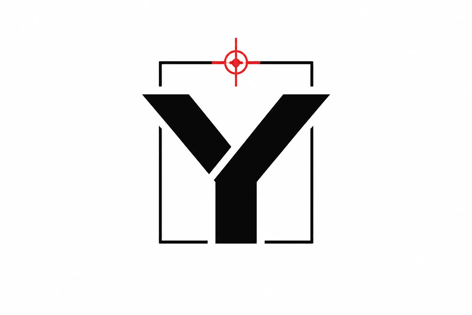
Single-Color and Layered Concept Direction
When a line-art idea reaches a shop, the useful question is not whether the preview looks attractive. It is whether the visible decisions are clear enough to compare, revise, and hand off.
Single-color line art and layered line-art concepts can describe the same subject through different recognition cues. One may depend on an outer silhouette. Another may rely on interior contours, separated parts, or controlled negative space.
This page compares those directions as design concepts. A preview records intended appearance. It does not establish material compatibility, machine behavior, rights clearance, or final output quality.

More specific pages
These pages continue the topic in smaller, more specific directions.
Start With the Recognition Cue
Identify the feature that makes the subject recognizable at a glance. It may be the outer contour, a distinctive opening, a bridge between parts, or an overlap between forms.
Check that cue without the surrounding presentation mockup and at the intended approximate size. A large preview can make a weak junction or closing counter look resolved.
Research on silhouettes, outlines, and selected contours supports a narrow visual point: different representations create different identification demands. The result depends on the subject, viewpoint, structure, and viewing condition.
Keep three questions separate:
- What does the viewer recognize from the outer shape?
- Which detail requires an interior line, counter, or gap?
- Which unresolved effect belongs to the designer, and which requires shop confirmation?
That separation prevents a persuasive concept from being treated as a completed handoff.
Silhouette or Outline? A Recognition-First Concept Check
A silhouette uses a filled region to communicate the subject through boundary and mass. An outline uses strokes or open visual boundaries, leaving more of the surrounding field visible inside the subject.
Neither direction wins in every context. A silhouette can make the outer shape immediate while concealing internal distinctions. An outline can preserve part relationships while asking the viewer to interpret more intersections, gaps, and line endings.
Consider a hypothetical small bird badge. A filled shape may communicate the pose through its beak, back, and tail. At reduced scale, the eye, wing separation, or leg position may disappear because those features do not belong to the outer boundary.
An outline version may preserve the wing and body relationship. It can also introduce crossings where the viewer must decide which contour describes the subject and which line describes an internal feature.
The practical choice is not simply filled or unfilled. It is which visible cue carries recognition for this subject at this scale.
When the Outer Contour Carries the Form
Use a silhouette-led review when the subject has a distinctive outer shape and relatively few essential internal distinctions. Inspect the boundary from a distance, along with projections, indentations, narrow openings, and the figure-to-background relationship.
Compare a full presentation view with a smaller concept view. A contour that reads clearly in the first may lose the notch or opening that separates one form from another.
Available research suggests that outline shape can be especially important for some living forms, while other subjects may become more ambiguous when reduced to a boundary alone. Treat that as a recognition boundary, not a rule for every icon, monogram, sign, or product mark.
Record the result as an artwork decision: “The outer contour carries the primary cue.” Do not record it as proof that the file is ready for a particular process.
When Interior Lines Carry the Form
Choose an outline-dependent direction when internal structure keeps the subject distinguishable. A handle inside a vessel, a wing inside a bird, or a letter counter inside a monogram may carry more information than the outside edge.
Inspect each interior stroke for a clear role. It should describe a part, separation, fold, opening, or overlap that the concept needs. Decorative lines can compete with those cues when several strokes meet in a small area.
Studies of line drawings support reviewing selected contours rather than copying every visible edge. In practice, ask whether each line explains a structural change or merely follows a tonal or incidental edge.
When the role is unclear, mark the stroke as provisional. Simplification can happen before the shop evaluates paths, bridges, gaps, and material-specific questions.
Contours, Counters, Bridges, and Gaps
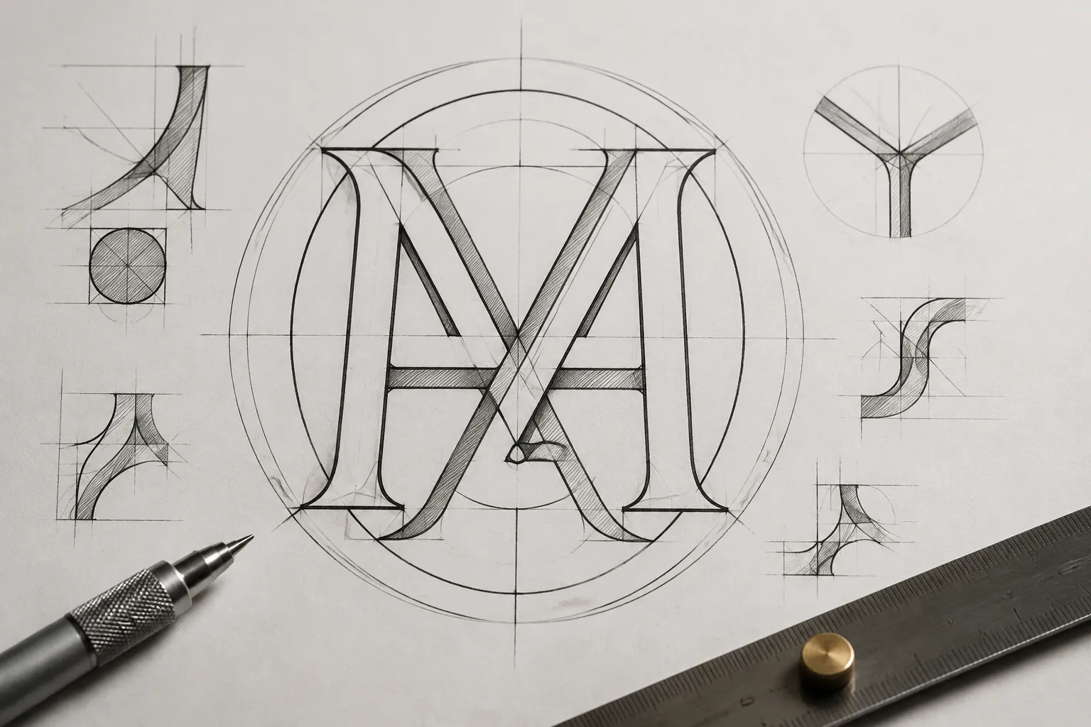
Junctions often decide whether a concept reads cleanly. A junction is where contours touch, cross, stop, or divide a visible region. These points can clarify depth and part ownership, but inconsistent ownership can create ambiguity.
Contour
A contour describes the edge of a form. In a single-color concept, the outer contour may define nearly the entire subject. In a layered concept, a contour may belong to one part while another layer interrupts or covers it.
Trace the contour and identify where it changes direction. Sharp turns, narrow notches, and long smooth runs deserve separate review because they carry different recognition information.
A path view can show whether a contour is continuous, interrupted, duplicated, or still represented only as a visual stroke. Those states should not share one approval label.
Counter
A counter is an enclosed or partly enclosed negative space, such as the opening inside a letter, handle, or loop. It can preserve recognition by separating a form from itself.
For a monogram concept, inspect whether each counter is intentional and remains understandable at the planned concept scale. The preview shows the intended opening; it cannot establish whether a particular shop, process, or material will retain it.
Mark each counter as decided, provisional, or shop-dependent. That ownership label makes the next conversation more precise.
Bridge
A bridge connects otherwise separate parts. It may be a visual design choice, a result of overlapping regions, or an unresolved assumption about how the artwork will be handled.
A bridge that looks structural in the preview may instead be a crossing line or visual overlap. Inspect the path view and state what it represents. If the role is unsettled, route it as a handoff question.
Gap
A gap separates visible regions. It may identify an opening, distinguish adjacent parts, or create the negative space that makes a symbol readable.
Compare the gap at presentation size and at the smaller review size. If recognition depends on it, state that dependency in the concept notes. Any minimum dimension or process-specific behavior remains material-specific and shop-dependent.
Layered Line-Art Concepts: What the Layers Own
Layering introduces a second kind of meaning. It assigns parts, boundaries, and overlaps to separate regions that someone must interpret during cleanup and handoff.
A layered concept should identify:
- The visible parts or regions.
- The front-to-back relationship, where one exists.
- Which boundaries are shared.
- Which gaps are intentional negative space.
- Which lines are descriptive strokes rather than region boundaries.
For a hypothetical plaque, one layer might contain the main badge shape while another contains a leaf or ribbon crossing it. The preview can communicate the intended overlap. The path view should expose the boundary and crossing relationship separately.
A layered preview can be more expressive than a single-color version while leaving more ownership questions unresolved. A layer is a documented design decision until the shop confirms how that structure fits its workflow.
Overlap and Junction Review
At every overlap, state which part is in front, which contour should stop, and whether the crossing remains visible. Junction cues can help viewers interpret depth, but the same junction can confuse them when line ownership changes without a visible reason.
Use three statuses:
- Decided: the visual relationship is approved.
- Provisional: the relationship is an intentional proposal awaiting review.
- Shop-dependent: the relationship may require a process-specific interpretation.
This distinction keeps a visual assumption from becoming an undocumented production requirement.
Scale Review Before Approval
Recognition changes with scale. A contour that reads clearly in a large concept preview may become a short notch, crowded junction, or apparently closed counter when reduced.
Review the concept in three visible states: presentation size, intended product scale, and a smaller inspection view. The purpose is comparison, not certification.
- Does the silhouette still identify the subject?
- Do counters remain open in the concept?
- Do bridges still read as deliberate connections?
- Do gaps separate the intended parts?
- Do overlapping layers remain distinguishable?
- Do interior strokes support recognition or create noise?
A scale change can move the preferred direction from layered to single-color, or from outline-dependent to a simplified hybrid concept. Document the reason in visual terms and leave process suitability for the relevant shop review.
Comparing the Two Directions
A single-color concept concentrates the decision in filled mass, outer boundary, and negative space. Review is often faster when identity rests on a strong silhouette, but internal distinctions may need to be omitted or represented by controlled counters and gaps.
A layered concept distributes meaning across parts, boundaries, and overlaps. It can preserve more internal structure, but it demands clearer layer ownership and closer review of junctions, shared edges, and scale behavior.
| Review criterion | Single-color direction | Layered direction |
|---|---|---|
| Primary cue | Filled mass and outer contour | Parts, boundaries, and overlap relationships |
| Common ambiguity | Internal features disappear | Layer ownership becomes unclear |
| Main visual check | Silhouette, counters, and gaps | Overlaps, junctions, and layer boundaries |
| Useful approval note | “The outer contour carries recognition.” | “The parts and their order are intentionally defined.” |
| Unresolved handoff issue | Whether important internal detail can be omitted | How the proposed layer structure should be interpreted |
This comparison concerns concept direction, not machine outcomes. Paths, materials, equipment, setup, testing, and acceptance criteria remain with the shop and the relevant documentation.
From Concept Preview to Shop Handoff
A useful handoff begins with a visible decision record. Include the selected direction, primary recognition cue, intended approximate scale, and features that must remain distinguishable.
Assign unresolved questions to their owners:
- The designer confirms contour, counter, bridge, gap, overlap, and layer intent.
- The customer or project owner confirms the visual direction and required source documentation.
- The shop operator confirms process-specific path interpretation, equipment context, material questions, and test-piece requirements.
- The relevant manufacturer or material supplier provides current equipment or material documentation.
- The rights holder or qualified local professional handles questions outside visual design review.
A concise note might read: “Layered line-art concept selected. Outer badge contour and central counter are decided. Ribbon overlap and narrow interior gap remain provisional. Review path structure, material context, and test-piece requirements with the shop.”
That note describes the artwork without claiming a final result.
Common Concept Mix-Ups
- A filled silhouette is not a simplified final file.
- The preview may show a strong mass while cleanup still requires decisions about contours, counters, and ownership.
- An outline is not a complete path description.
- A visible stroke can represent an intended contour without revealing how it should be handled in a specific workflow.
- A layer is not proof of separate process steps.
- It may describe visual parts, while the shop determines how those parts map to preparation and testing.
- A clean mockup is not output evidence.
- Presentation context can improve inspection while hiding scale, material, equipment, and setup dependencies.
- Recognition research is not fabrication evidence.
- The reviewed studies help explain why contours, silhouettes, and junctions can matter to viewers. They do not establish gap dimensions, registration behavior, material compatibility, equipment settings, extraction plans, or shop acceptance.
A Practical Decision Record
- Selected direction: single-color, layered, or still under comparison.
- Primary recognition cue: outer silhouette, interior contour, counter, bridge, gap, or overlap.
- Scale dependency: the cue that changes when the concept is reduced.
- Ownership status: decided, provisional, or shop-dependent for each unresolved feature.
- Next handoff action: who must confirm the next question and what information they need.
The result should be a reviewable concept, not an unsupported statement about production readiness. A clear record makes the visible artwork easier to discuss and the unresolved work easier to route.
FAQ
Is single-color line art always easier to hand off?
Not necessarily. A strong silhouette can reduce internal decisions, but a subject may depend on counters, gaps, or interior distinctions. Compare the recognition cue at the intended scale.
Should every interior contour be kept in an outline concept?
No. Keep a line when it explains a needed part or relationship. Mark uncertain strokes for revision instead of preserving every incidental edge.
When is a layered concept worth reviewing?
A layered direction is useful when separate parts, overlaps, or negative spaces carry important meaning. Its added structure also creates more ownership questions, so document the relationships between regions.
Can a concept preview show that artwork is ready for production?
No. A preview shows intended visual properties. The actual file, process, equipment, material, rights documentation, and shop review determine what remains unresolved.
What should a shop receive with the concept?
Send the selected direction, recognition cue, approximate scale, approved and provisional features, layer or path notes, source-rights documentation where applicable, and specific questions requiring confirmation.
The Working Verdict
Choose the direction that makes the subject’s essential cue easiest to inspect at the intended scale. Then document what the preview decides and what the shop must still confirm.
Single-color line art concentrates meaning in mass, contour, counters, and gaps. Layered line-art concepts distribute meaning across parts, overlaps, and boundaries. The useful decision is not which style is generally better; it is which structure communicates the approved idea while keeping remaining questions visible, assigned, and unresolved until the right owner reviews them.
Sources
- Why Do Line Drawings Work? A Realism Hypothesis
- Identification of Everyday Objects on the Basis of Silhouette and Outline Versions
- Where to draw the line?
- Outline shape is a mediator of object recognition that is particularly important for living things
- When are viewpoint costs greater for silhouettes than for shaded images?
- What Line Drawings Reveal About the Visual Brain